BOBBY.G Portfolio
/BOBBY.G Portfolio
/Overview
BOBBY.G
Bobby Gutierrez is a highly regarded Casting Director and Executive Producer who has been working at the highest levels of the international fashion industry for over 20+ years.
Services Rendered
01/ Art Direction
02/ Content Strategy
Opportunity
For years my close friend BOBBY G has worked at the highest levels of the international fashion industry. In celebration of his 24th year in the business, I was retained to create a new site and a visual identity for BOBBY to showcase his incredible portfolio.
Approach
Because of Bobby’s busy production schedule and his goal of launching as quickly as possible, Bobby and I sat down and created a development calendar that he felt comfortable working with. I explained to Bobby that the more time we spent on gather, organizing, and curating his massive body of work, the less time we would have to spend on actual development and debugging his site.
Solution
With this approach top-of-mind, we organized over 20+ of Bobby’s content into specific silos by year, project, photographer, model, and publication into a clear visual map which was simple and intuitive to work off of.
We spent 75% of our time and resources organizing content, 20% on development, and 5% on testing and editing.
OUTCOME
/Results
In the end, it only took me 14 days to complete Bobby’s new website and visual identity. The site and Bobby’s identity’s color palettes are flexible as well and simple and on-brand.
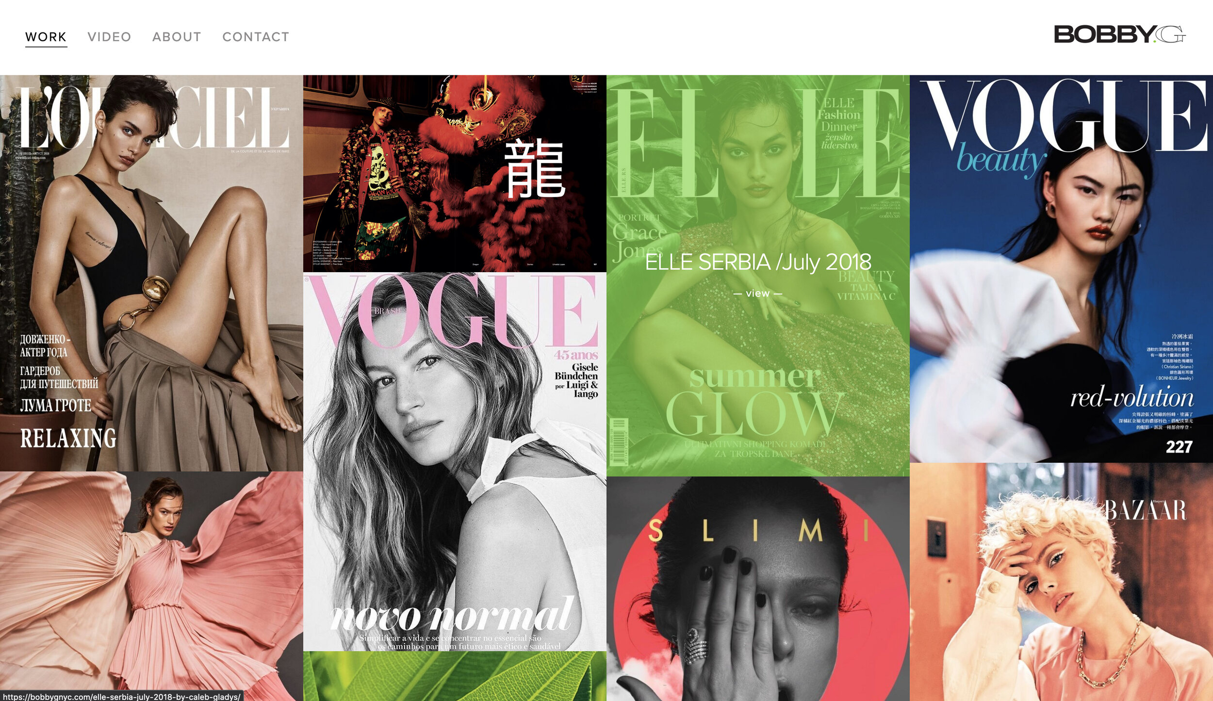
BOBBY.G Portfolio Images
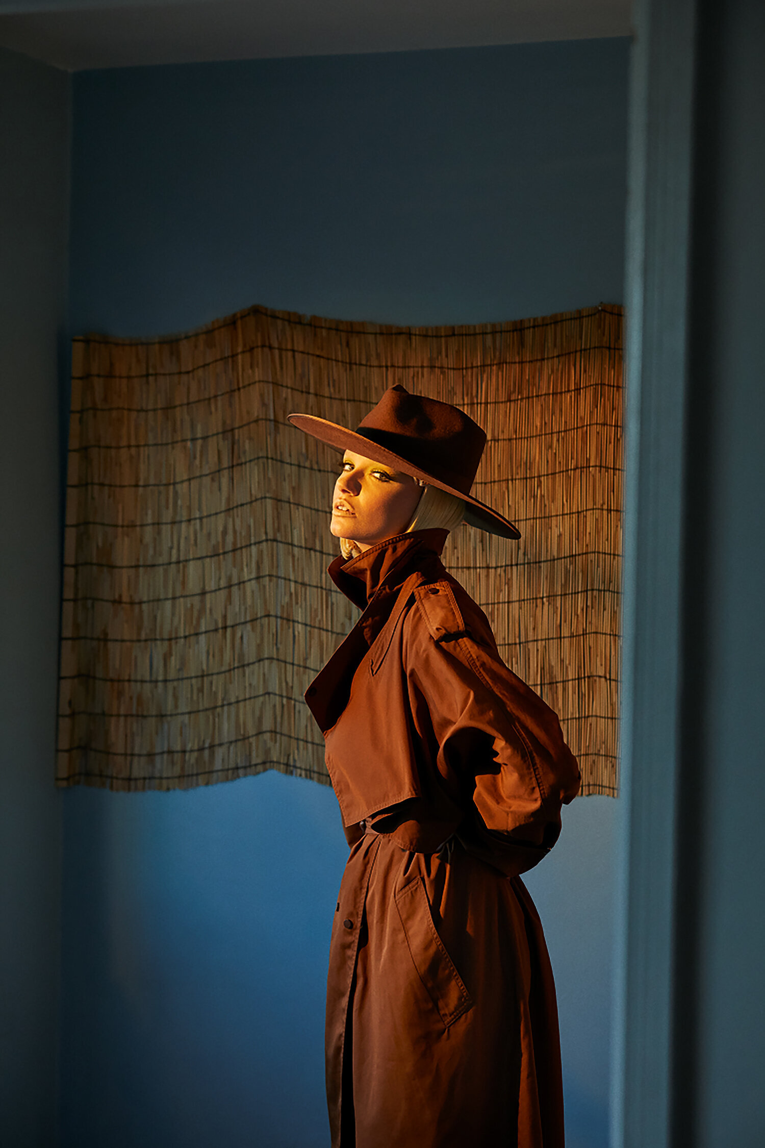
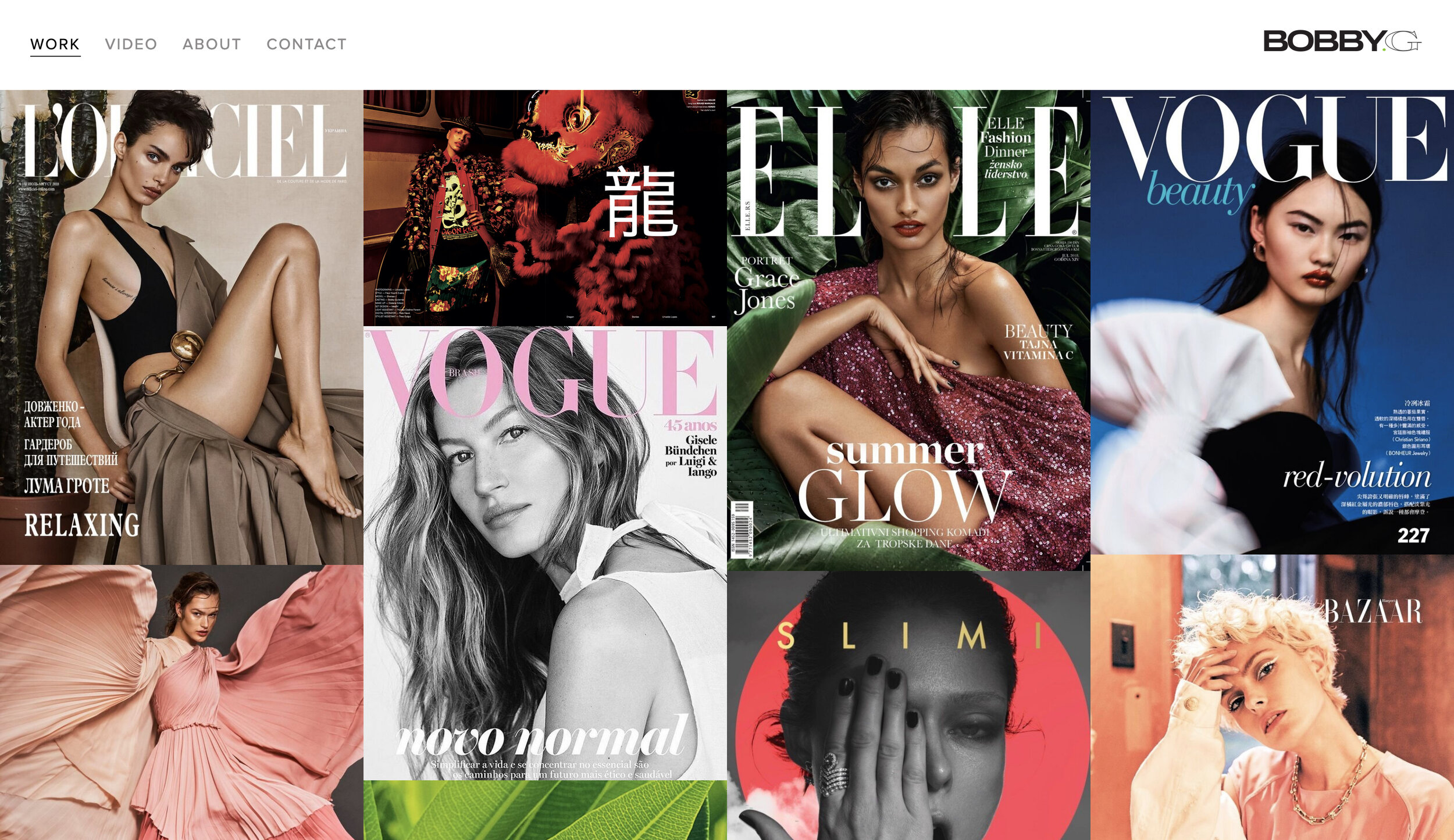
Select work from Bobby’s extensive body of work. Bobby’s work internationally with major fashion designers, entertainers, models, photographers, and publications.
/Challenges
/Solutions
01/ Huge quantity of work that needed to be organized and edited.
We spent 75% of our time and resources organizing content with the help of a visual PERT creative development chart to streamline our pre-production process.
02/ When all of the Client’s content is beautiful, which content do you use?
This turned out to be a critical issue. ALL of Bobby’s work is incredible. We decided to make sure the home of the site was inclusive and international in flavor. We also paid keen attention to the style, color palette, and type of content presented on the top third of the site.
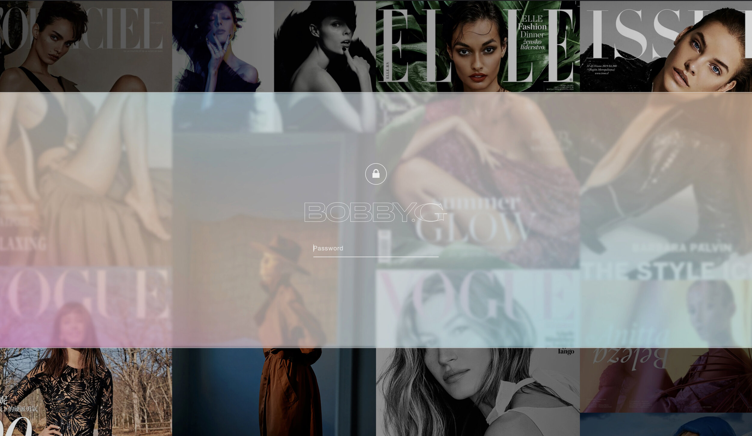
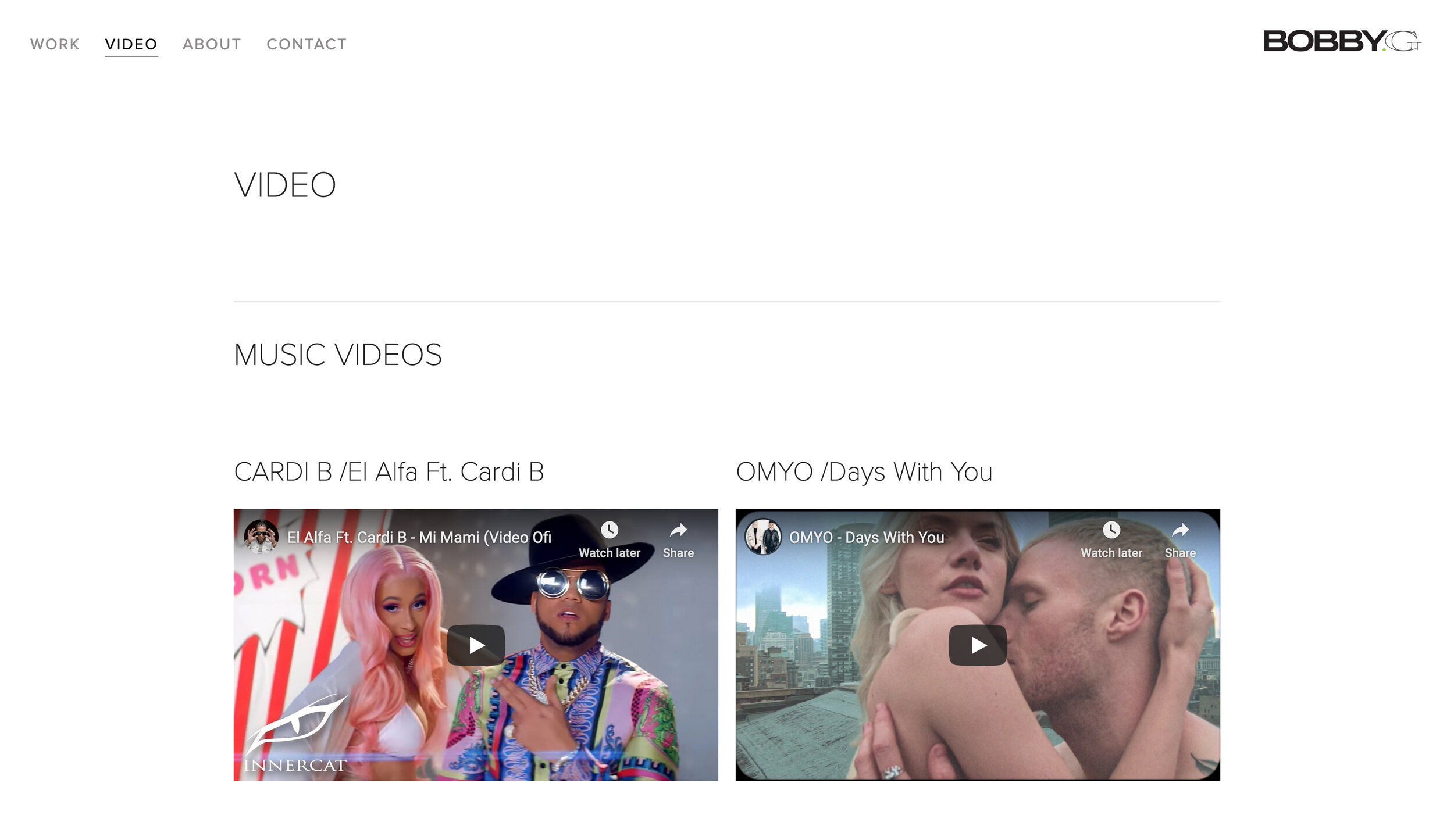
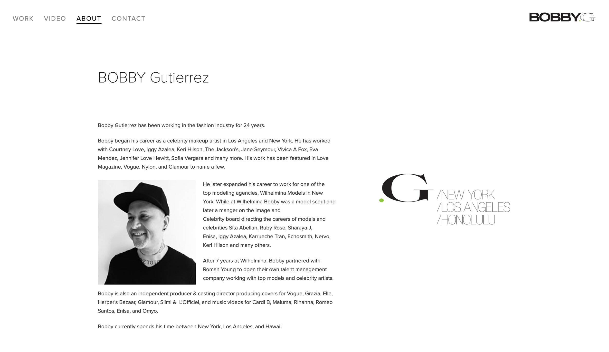
BOBBY.G Website
Screen grabs from Bobby’s website.
BOBBY.G Website UI
I keep the UI very simple while at the same time retaining the depth of Bobby’s content. We decided to utilize color (in this case green) as a point to show support for different causes that are important to Bobby. For example, during HIV Prevention Month, the colors will switch to red. During Breast Cancer Awareness Month, we will switch to pink.
Nullam quis massa sit amet nibh viverra malesuada
BOBBY.G Logomark
Screen grabs of the BOBBY.G logo mark and color usage.
We elected to use the color green as our first color to represent growth, harmony, and spring season freshness.
.WORK /Bobby.G Portfolio


