
CHAZARA Foundation

/CHAZARA Foundation
/Overview
CHAZARA
The CHAZARA Foundation is a San Francisco based non-profit that provides financial and educational assistance to underprivileged Chinese children living in the Ningxia province of Central China.
Services Rendered
01/ Customer Experience
02/ Key Messaging
03/ Identity & Positioning
04/ Visual Language & Art Direction
05/ Design Production & Execution
06/ Content Strategy
07/ Art Direction
08/ Photography
Opportunity & Approach
A few years ago I created the identity for a US based non-profit which does amazing work in Central China. I am close friends with the founder of the non-profit who asked for help in developing the non-profit’s brand.
After a bit of conversation on the goals of the non-profit, I was invited to travel with the core team to visit the Ningxia province in Central China. While there my job was to document the trip as a photographer and get a boots-on-the-ground sense of the importance of the work the non-profit would be doing in this area of China.
Solution
Based on my experience in Central China, I researched an appropriate name, created the logomark of the non-profit, and later developed a simple website and set of brand guidelines.
The logo is comprised of four fingerprints (from both little fingers & both thumbs) to create a butterfly. The non-profit’s name, CHAZARA (which I researched and was later adopted by the non-profit), is a shortened name of a butterfly that is indigenous to that region of Asia. The butterfly logo was created to represent a positive metamorphosis & freedom through education.
Because of the nature of the design, each student of the CHAZARA program was able to create their own butterfly with their own fingerprints.
OUTCOME
/Results
We created an award-wining set of designs that were simple, intimate, and personal to each recipient of CHAZARA scholarships.
CHAZARA Brand Identity
Screengrabs of the simple CHAZARA brand guidelines. The power of the design is its ability to become a personal representation of each recipient's own identity.

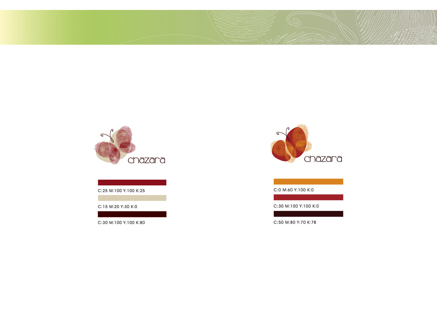
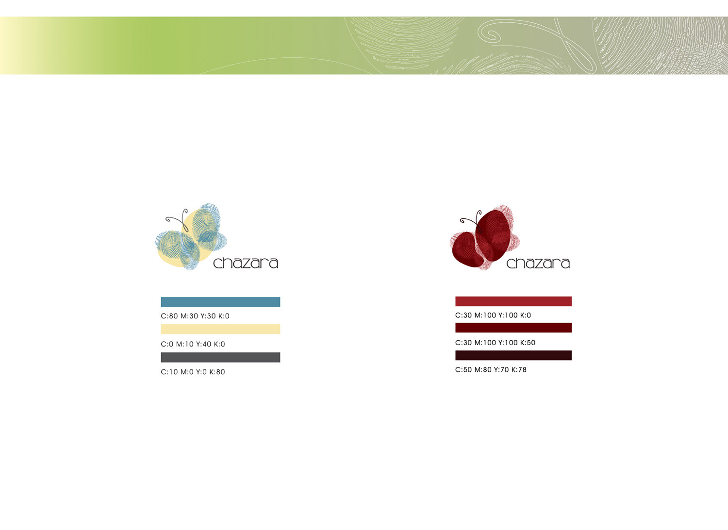
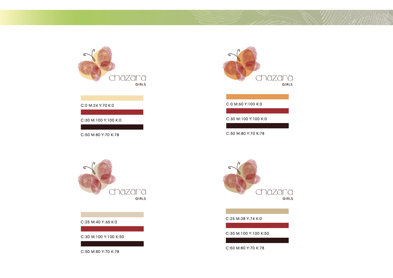
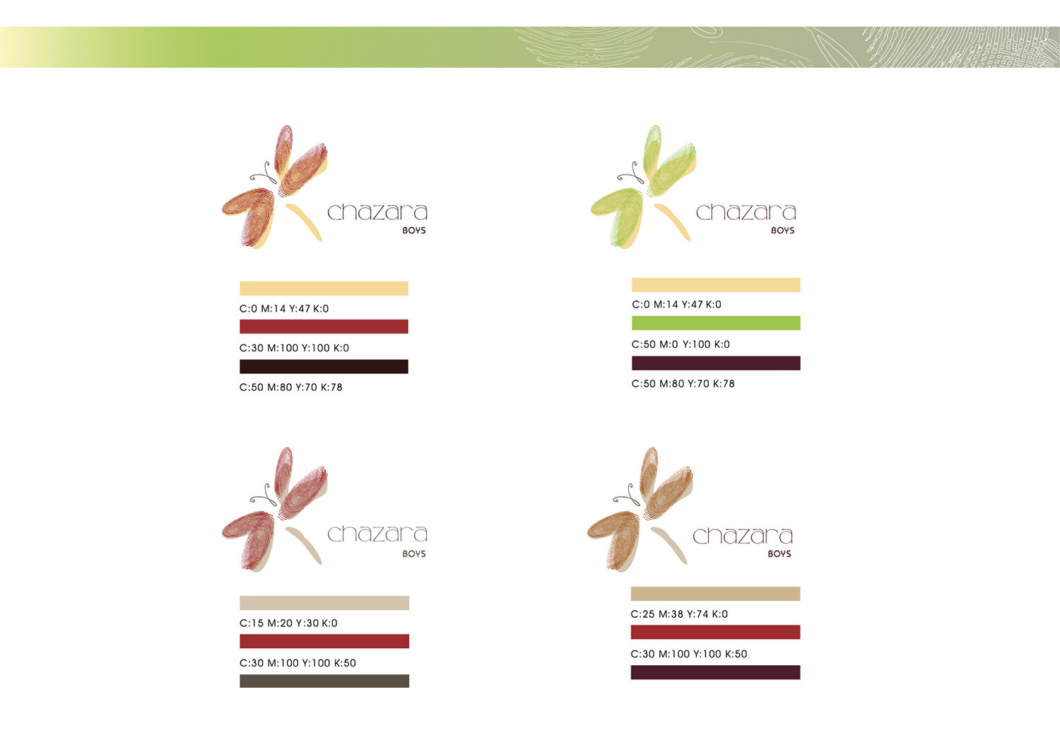
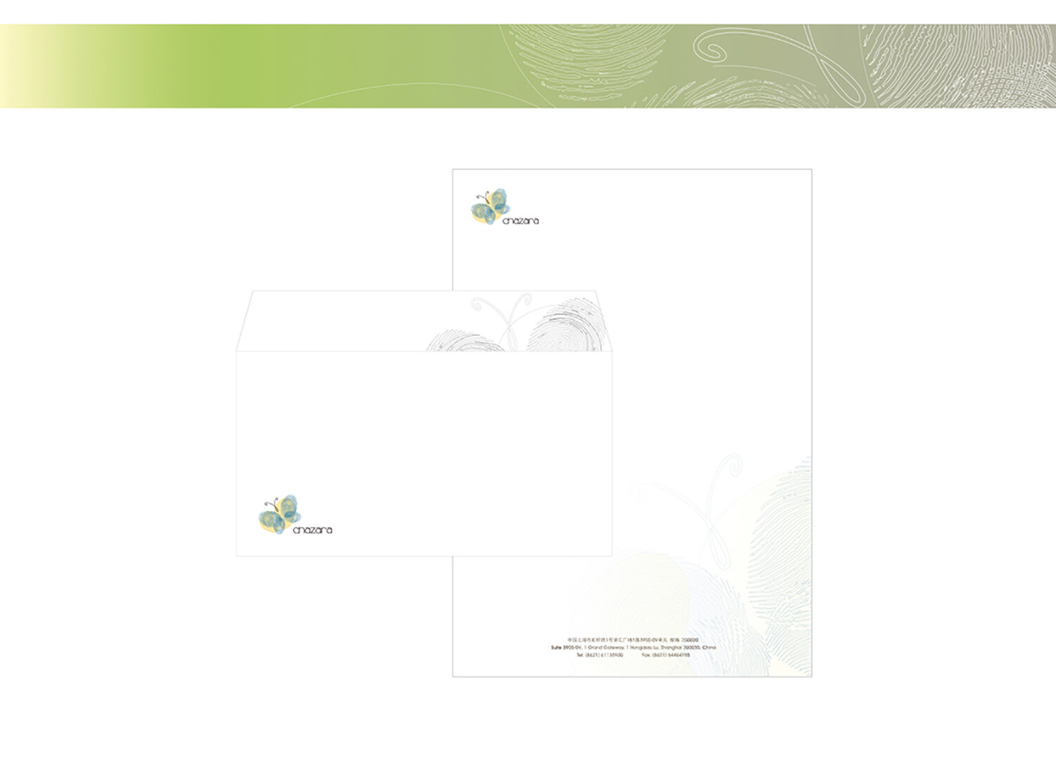
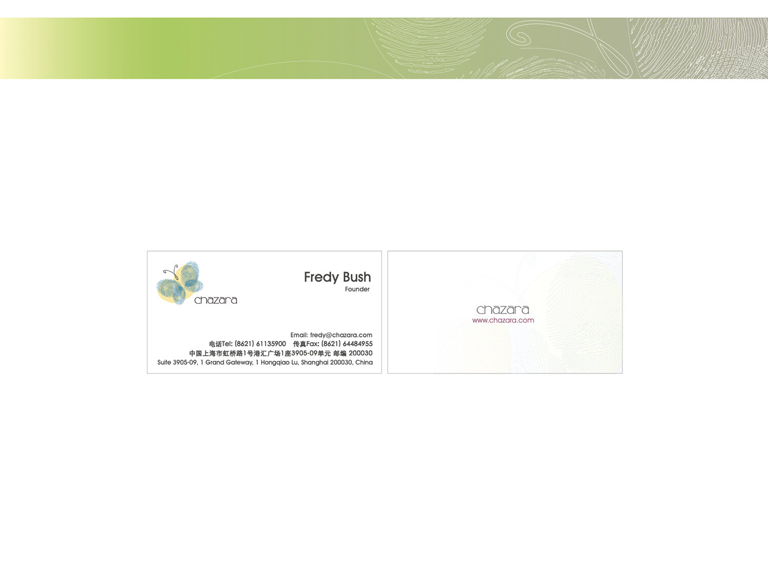
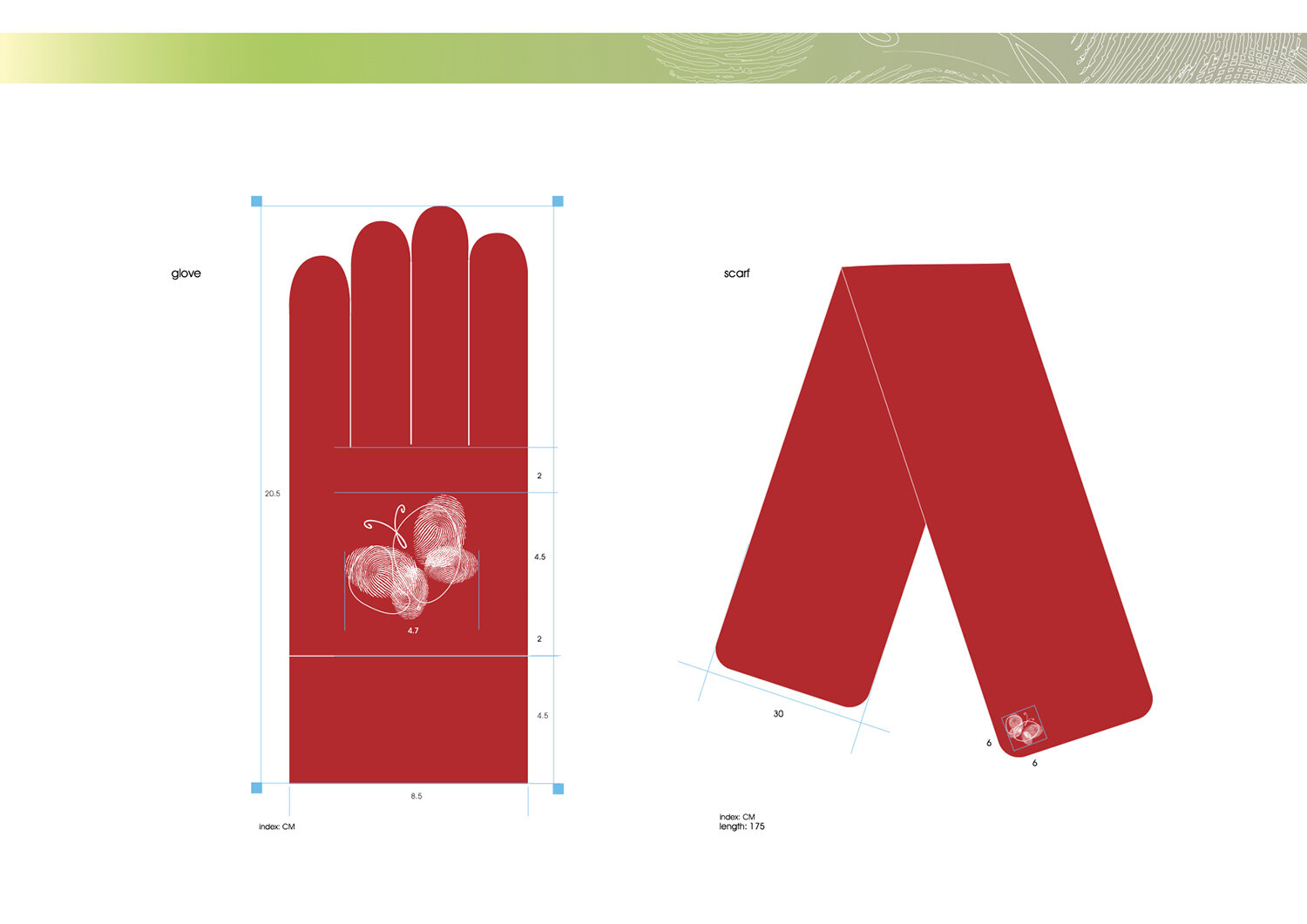
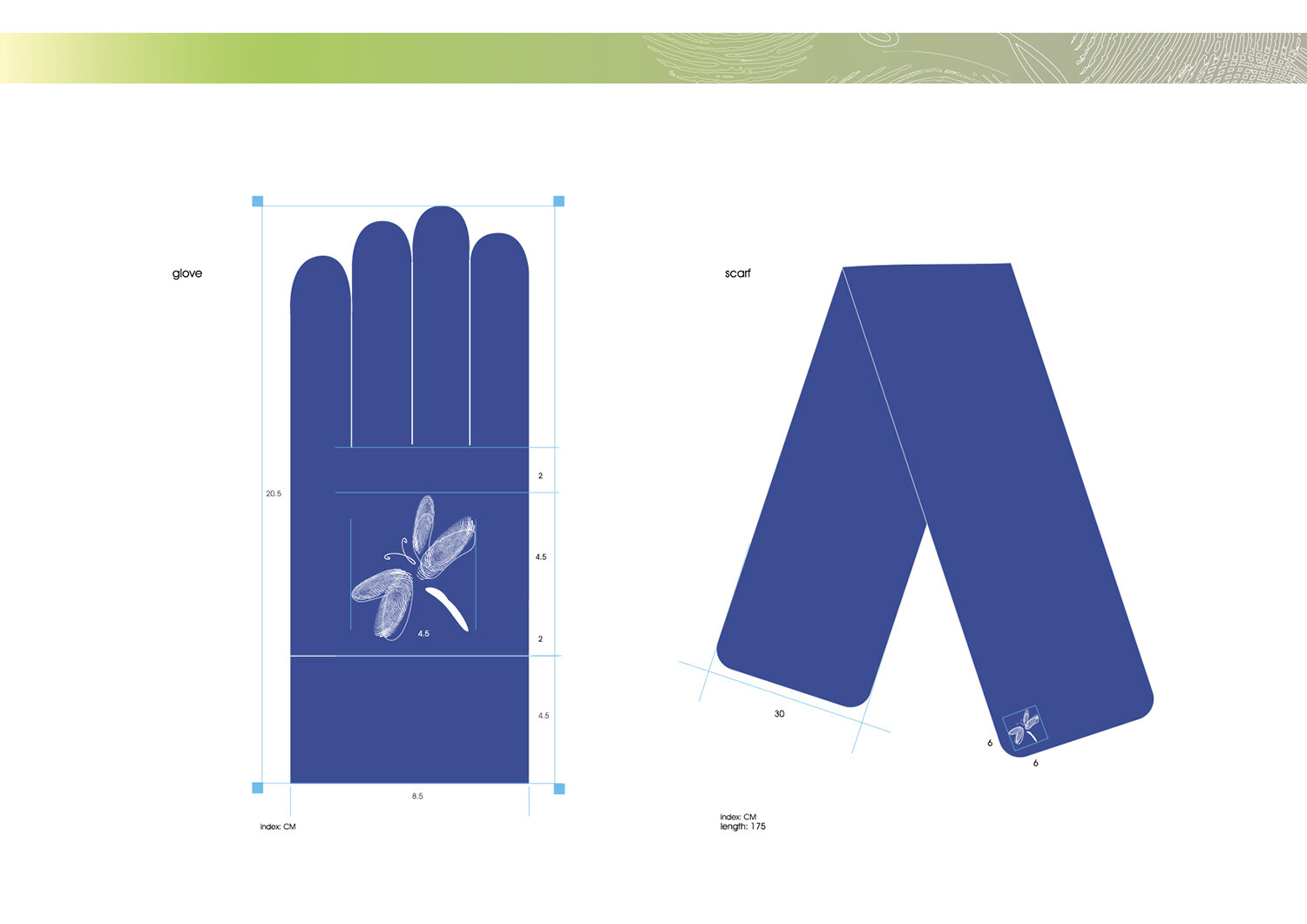
CHAZARA brand guidelines.
/Challenges
/Solutions
01/ Finding an appropriate name with an overarching and appropriate metaphorical meaning.
I was tasked with coming up with a name for the non-profit as a key element of the project brief. My team and I did a ton of research and finally came up with the concept of using the idea of personal metamorphosis through education. Once we settle on this approach, we decided that the stages of growth of a butterfly were an appropriate creative metaphor to use as a building block for the brand. After many hours of research, we discovered the Chazara briseis butterfly in Central China. when we dropped the “briseis” part of the name, Chazara had this beautiful sound to it so we settled on this name.
02/ Creating a logomark that was easy understand and at the same time universally personalized.
The second challenge was to create a logomark that would work with the Chazara name. We went through many revisions and finally settled on the idea of using fingerprints to create the wings of the Chazara butterfly. This solved many problems and turned out to a powerful yet elegant solution. Now, each recipient of a CHAZARA scholarship would create their own personal logo. Beautiful…
CHAZARA Website & Mural Design
Screen grabs of the CHAZARA website and a mural my team and I created for the CEO’s office in Shanghai.
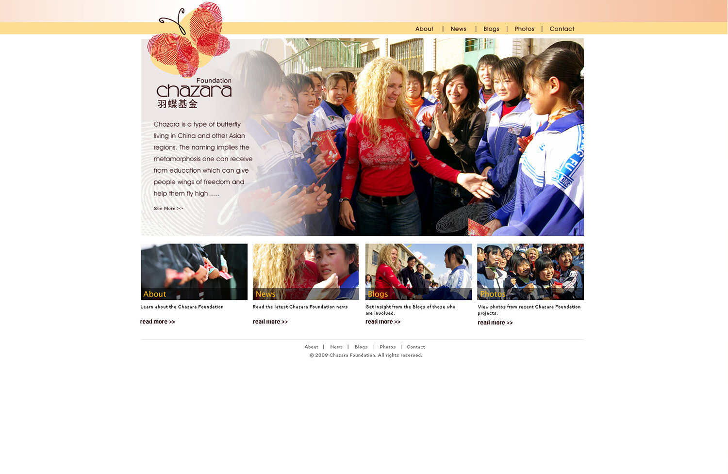
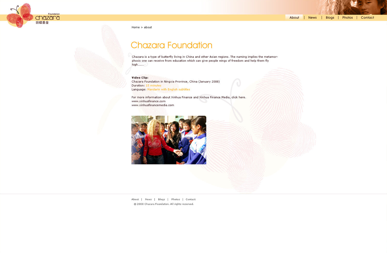
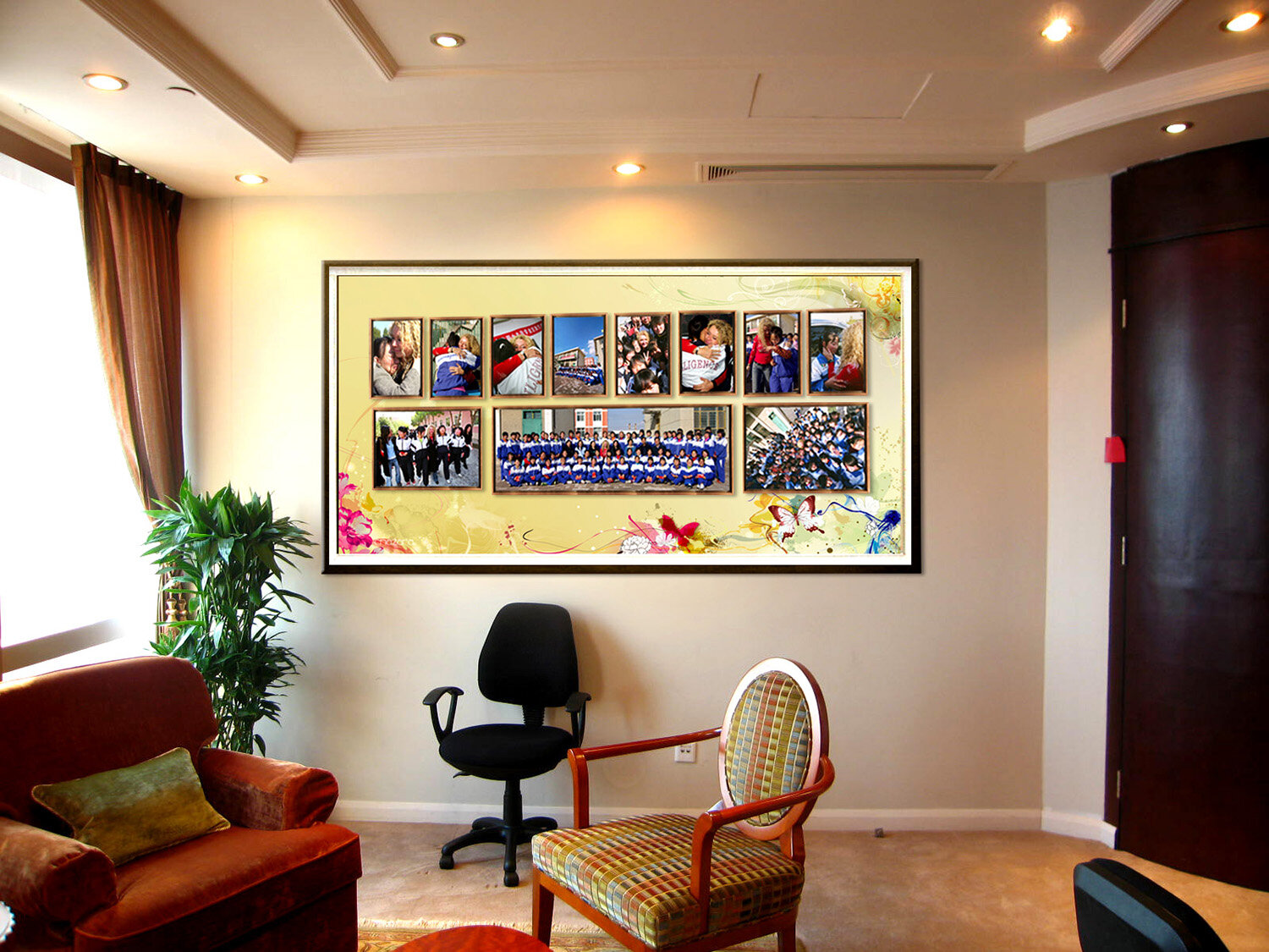
CHAZARA website and office mural.
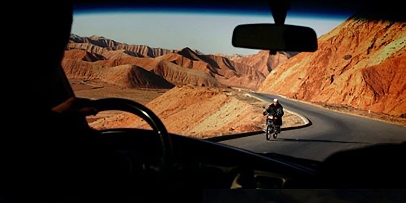
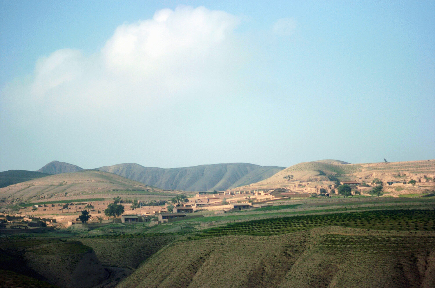
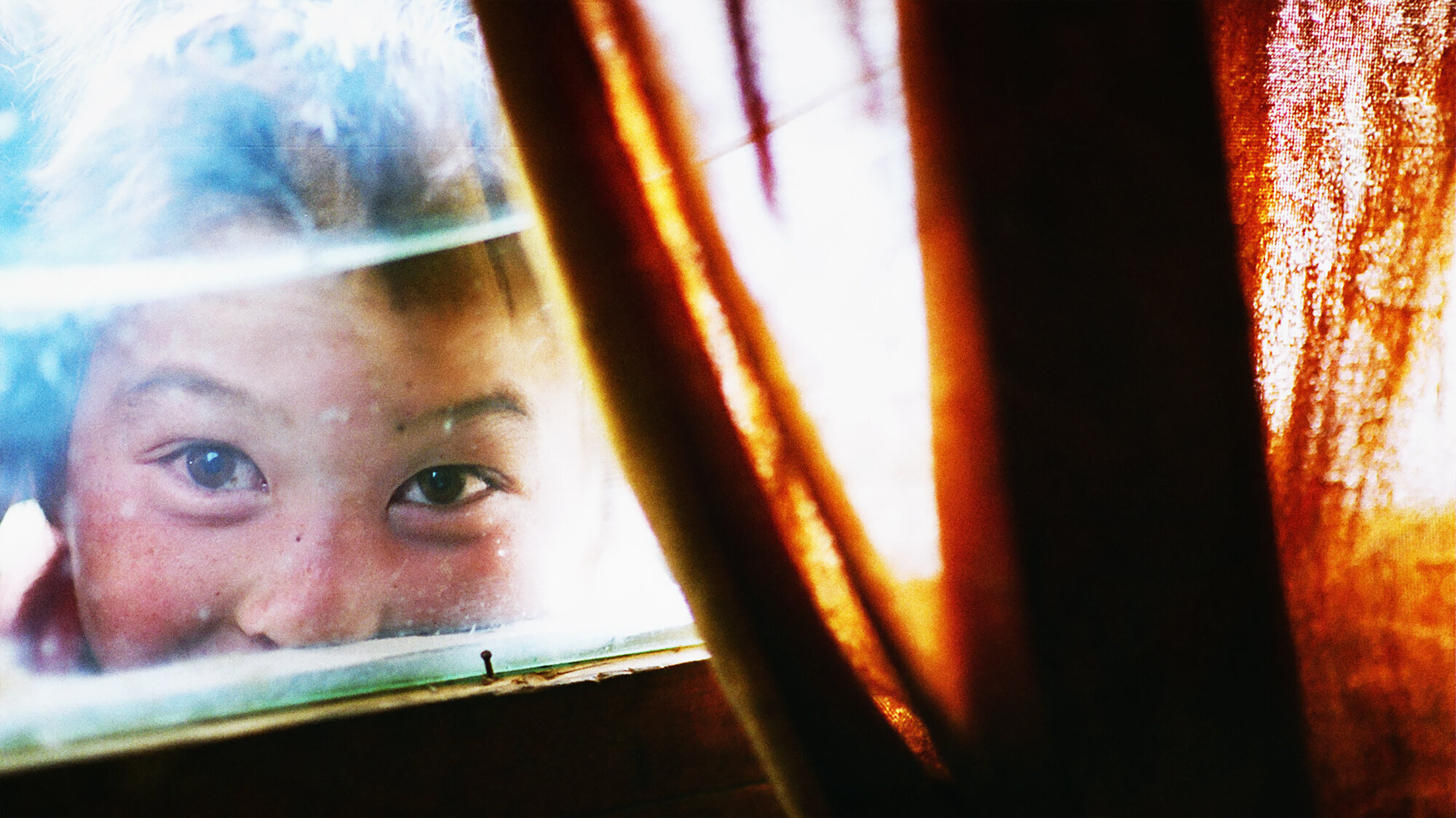
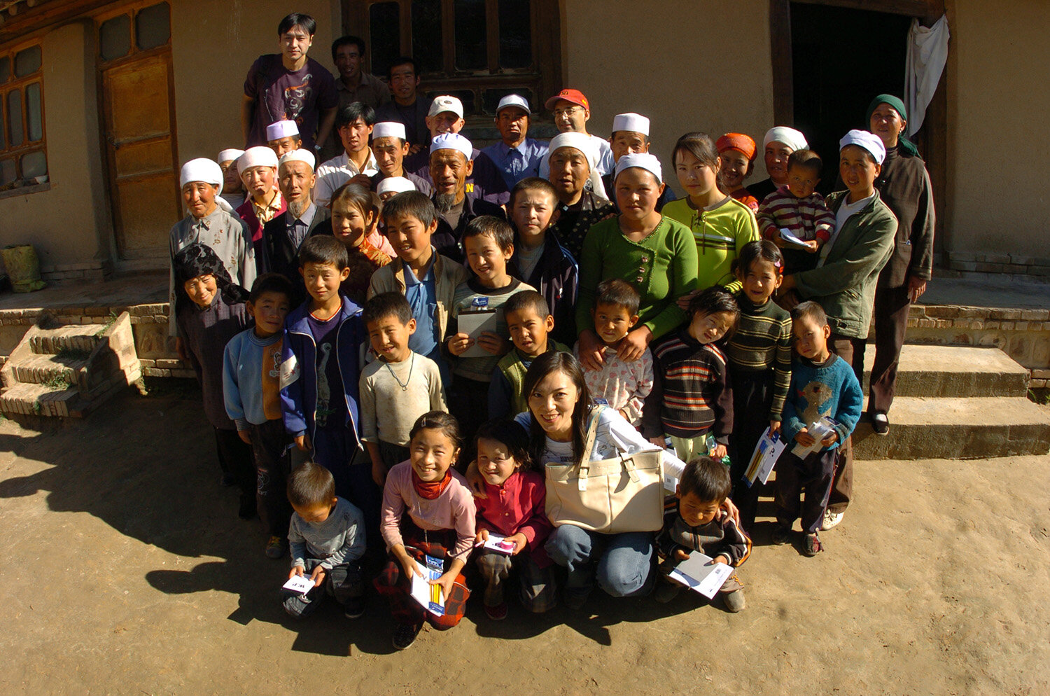
Select images from my first trip to the Ningxia province in Central China.
.WORK /CHAZARA Foundation